Case · Data Viz + Product UI · PipelineDeals
Reporting that turned a wall of CRM data into answers
A reporting system for sales managers: three linked visualization modes — regional map, stacked pipeline bars, period-over-period comparison — on top of a selectable, comparable deal table. One shell, one mental model, from big picture to individual deal.
01 Results
A reporting language, not just three reports.
Why it mattered
Designing from a persona’s questions rather than the database’s schema gave PipelineDeals a reporting language, not just three reports.
02 The Work
Three altitudes, one anatomy.
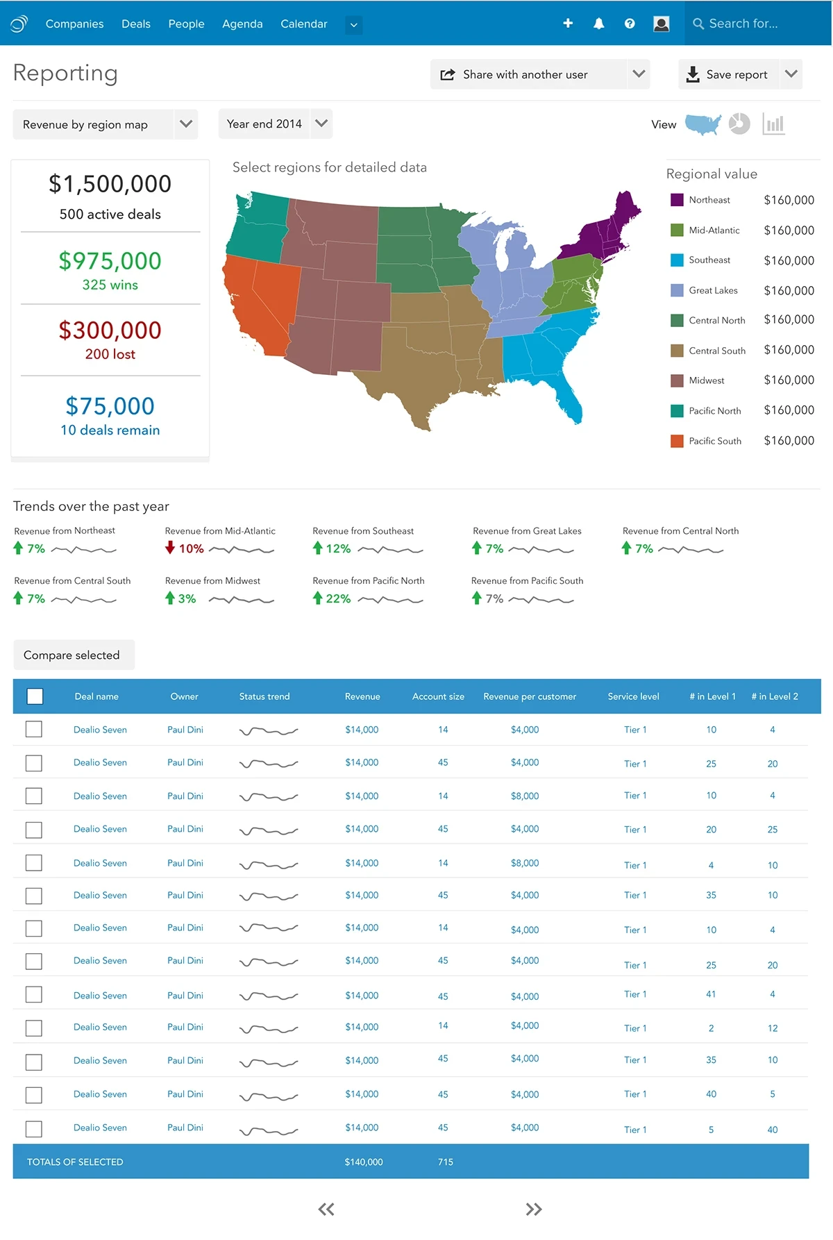
Three modes, one anatomy: summary rail, visualization, trend strip, deal table. Swipe through the shipped design.
Fig. 1–3 Region map, pipeline by stage, and period comparison — all inside the same reporting shell. Tap any figure to view it full size.
Every chart is a question a manager already asks. Every click is the next question.
The interaction principle behind the reporting system
03 Process
The data was there. The answers weren’t.
PipelineDeals is a CRM for small and mid-size sales teams. The data was all there — deals, owners, stages, territories — but reporting surfaced it as flat lists. A manager asking “how is my team actually doing, and why?” had to reconstruct the answer by hand.
The task: own the concept end to end — translate the sales-manager persona into an interaction model, design the visualizations and the table beneath them, and spec it for the D3 / Angular stack. Five requirements anchored every screen: team assessment, timeframe comparison, drill-down, directional signal, share and export.
Gap A
No quantitative read
Managers wanted real data visualization, not row-by-row tables, to assess performance at a glance.
Gap B
No comparison over time
No way to hold the current quarter against a previous timeframe and see what moved, or which direction.
Gap C
Insight died in the app
Findings couldn’t travel — no clean way to share a report or export the data to .csv.
Where: revenue by region
- Territory as the entry point. A choropleth of nine regions; selecting one drills into its deals.
- Summary rail. Pipeline split into wins, losses, and remaining, color-coded the same in every mode.
- Trend strip. Per-region sparklines and deltas, readable in one scan line.
Who & when: pipeline by stage
- Stacked by salesperson. One chart answers “where is the pipeline stuck?” and “whose deals are stuck there?”
- Time slider. Replays the pipeline’s shape over time — comparison as direct manipulation.
- People-level trends. Close rate, revenue, and value per deal, per rep.
Versus: compare deal closings
- Side-by-side periods. Twin donuts, share in the ring, percentages in the center, slices drag out for drill-down.
- Story points. The chart explains its own delta — the narrative a manager would otherwise write by hand.
- Shown with its brief. Persona requirements annotated on the artifact, presented to stakeholders together.
The floor: a table built for comparison
Under every visualization sits the same deal table, built to be compared, not just read: row selection, a “Compare selected” action, inline status sparklines, and a totals band that live-sums the selection. Every drill-down lands somewhere that can carry the full question.